Ants, Bees, Genomes & Evolution @ Queen Mary University London
Blast Visualization Google Summer of Code
Written by Hiten Chowdhary, cross-posted from http://www.hiten.io/blog/articles/gsoc-16/
This post is going to be about my GSoC 2016 project under Open Genome Informatics organisation along with Anurag Priyam and Yannick Wurm as my mentors.
About Project
Problem statement: BLAST visualizations library for Bioruby and SequenceServer. Brief explanation: It is now trivial to generate large amounts of DNA sequence data; the challenge lies in making sense of the data. In many cases, researchers can gain important insights by comparing newly obtained sequences to previously known sequences using BLAST (>100,000 citations). This project will focus on creating a reusable visualizations library for BLAST results and integrating it with SequenceServer, a popular BLAST server. BLAST results are text based but lack rich visual representation. Having a visualizations can greatly facilitate interpretation of data.
Warming Up
Before the project has started I was fairly acquainted with Ruby and Javascript. So I started with small bug fixes in order to get acquainted with the SequenceServer code. SequenceServer provided support for downloading the report generated in XML or TSV format. When one clicks the download button, it would generate the files and store it as tmp file until it is completely downloaded. But this process was repeated every time the download button was clicked, so we decided to save the tmp files generated in two formats, so if user needs it again no need to generate the file instead directly start the download. I also played around with some error handling issues just to get comfortable with the ruby part of the project. I helped improving the XML parsing of files and check for integrity issues and cases when a specific report user was searching and not found. I added checks in various places and raised appropriate error messages to help user figure out what was going wrong.
Visualizations
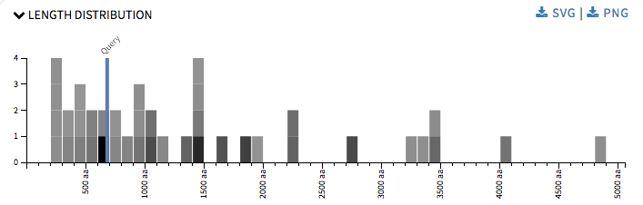
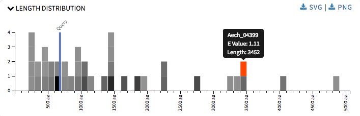
So by this time I had played around the SequenceServer code enough to know how it was working and it was time to get down to the real part of the project. I started up with Length Distribution graph. It is a simple histogram representing hit sequences length frequency. The rectangles were colored using a grey scale, where the darker the shade the more significant the hit is. This graph provided user with an idea about the all the length of the hit sequence and the length of the query sequence when one hovers over the rectangles. It will also help user in annotations, identifying proteins across species, validating gene predictions, etc The graph was drawn using d3.js.
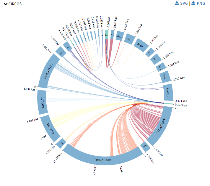
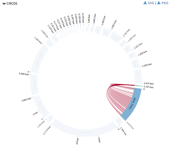
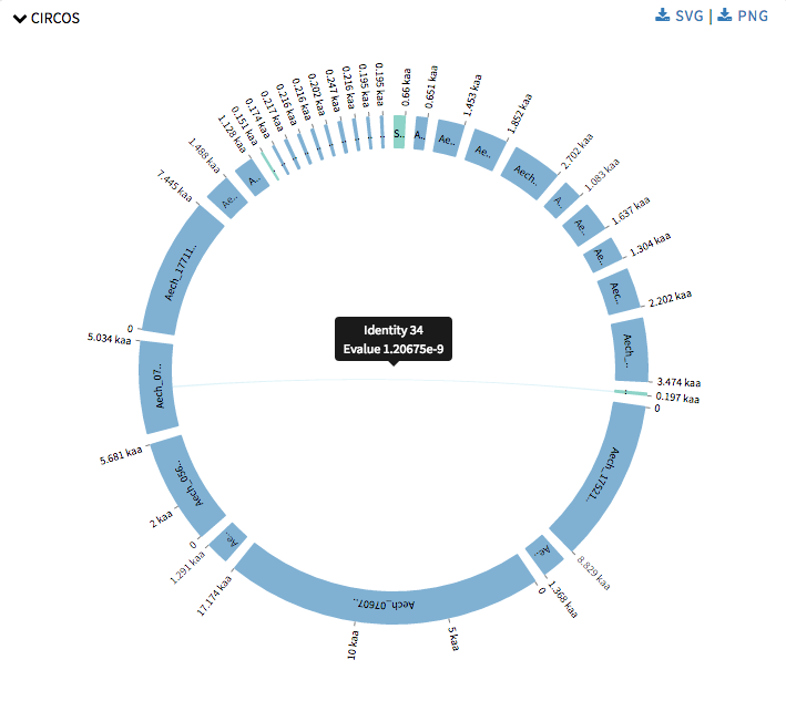
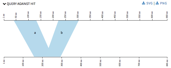
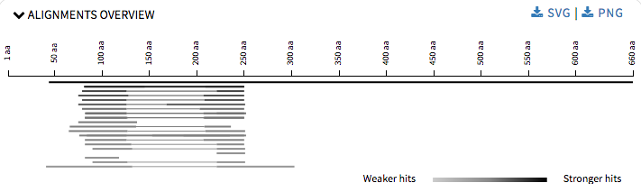
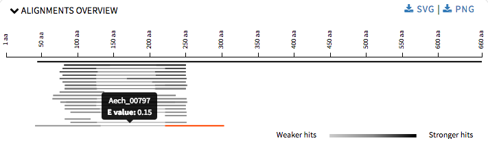
Next I started with Circos visualizations. Currently SequenceServer has Query against Hit to show alignment mapping between hit sequence and query sequence, Alignment overview to show alignment mapping between query sequence and all its hit sequences. Now Circos visualizations will add alignment mapping of multiple query and hit sequences to its arsenal. Circos visualizations is simple circos based graph with chords representing query sequence and hit sequence and ribbons represent the alignment mappings. The chords representing the query sequence is green in color and the others representing the hit sequence are blue in color. The ribbons are colored in red-yellow-blue color schema with red representing the most significant hit for a query and blue as least significant hit. One can hover over the ribbons to view its details such as the area this specific alignment covers on query or hit sequence, and the probability that this match was by chance. One can click on a chord to view its alignments. This was drawn using CircosJs.
Later I started with refinements of the previous graphs that SequenceServer provided. Now that we have four different visualizations and many of them use a lot of common code we decided to make the code modular, in order to make the code look better and to make adding new visualizations in the future, an much easier task and also to make changes in current ones easily. In Query against Hit the polygons were numbered alphabetical in order make it easier for user to understand which polygon corresponds to which alignment details provided below the graph.
For Alignment Overview I refactored the code to use ES6 modules, which is used by all the other visualizations too. I reduced the height of each graph so that at one user can view what options are being provided and then ahead accordingly. User can download the graphs in SVG or PNG formats.
My initial proposal was to add four new visualizations, but after detailed discussion with my mentors we decided that with the level of detailing required by one visualization we should limit ourselves to two.
Here is my list of commits
August 23, 2016